Ruth Health offered prenatal and postpartum care by video: pelvic floor therapists, lactation consultants, doulas and mental health support. Starting from their MVP, I led the ground-up design of the patient web app and its design system, with a credit model so all four kinds of care could be paid for from one balance.
After a birth, care tends to arrive in pieces. A pelvic floor therapist for recovery, a lactation consultant for feeding, a doula for the first weeks at home, someone to talk to about mood. Each is usually a separate provider, a separate booking and a separate bill, landing at the most exhausting point in a person's life.
Ruth put all four on one platform, by video, and already had an MVP. The job was to turn that MVP, and Ruth's updated brand guidelines, into a complete patient web app and a design system the team could build on.
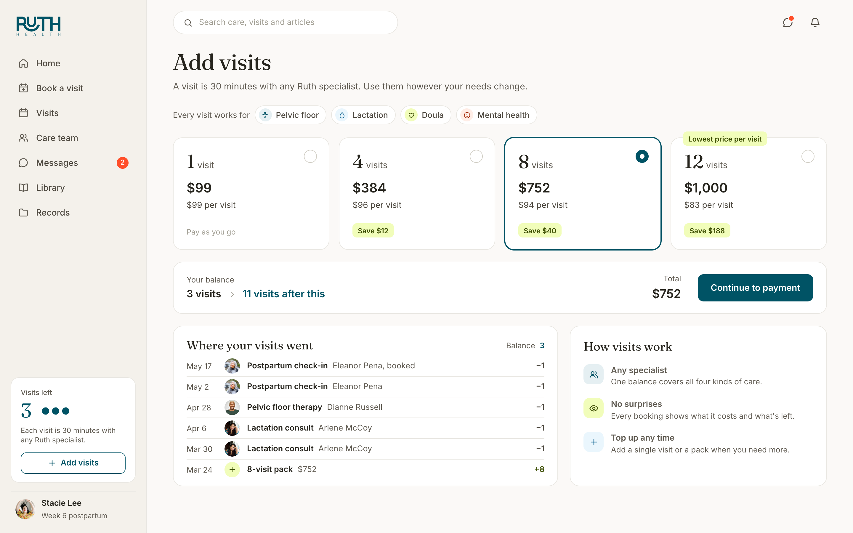
One balance for every specialist. Paying per session would have meant a checkout for every visit and a different price for every kind of care. I designed a credit model instead: buy a pack, spend one credit on a 30-minute visit with any specialist, and mix and match as needs change. In the design, that turned four services into one product, with packaged pricing from a single visit at $99 to twelve for $1,000.
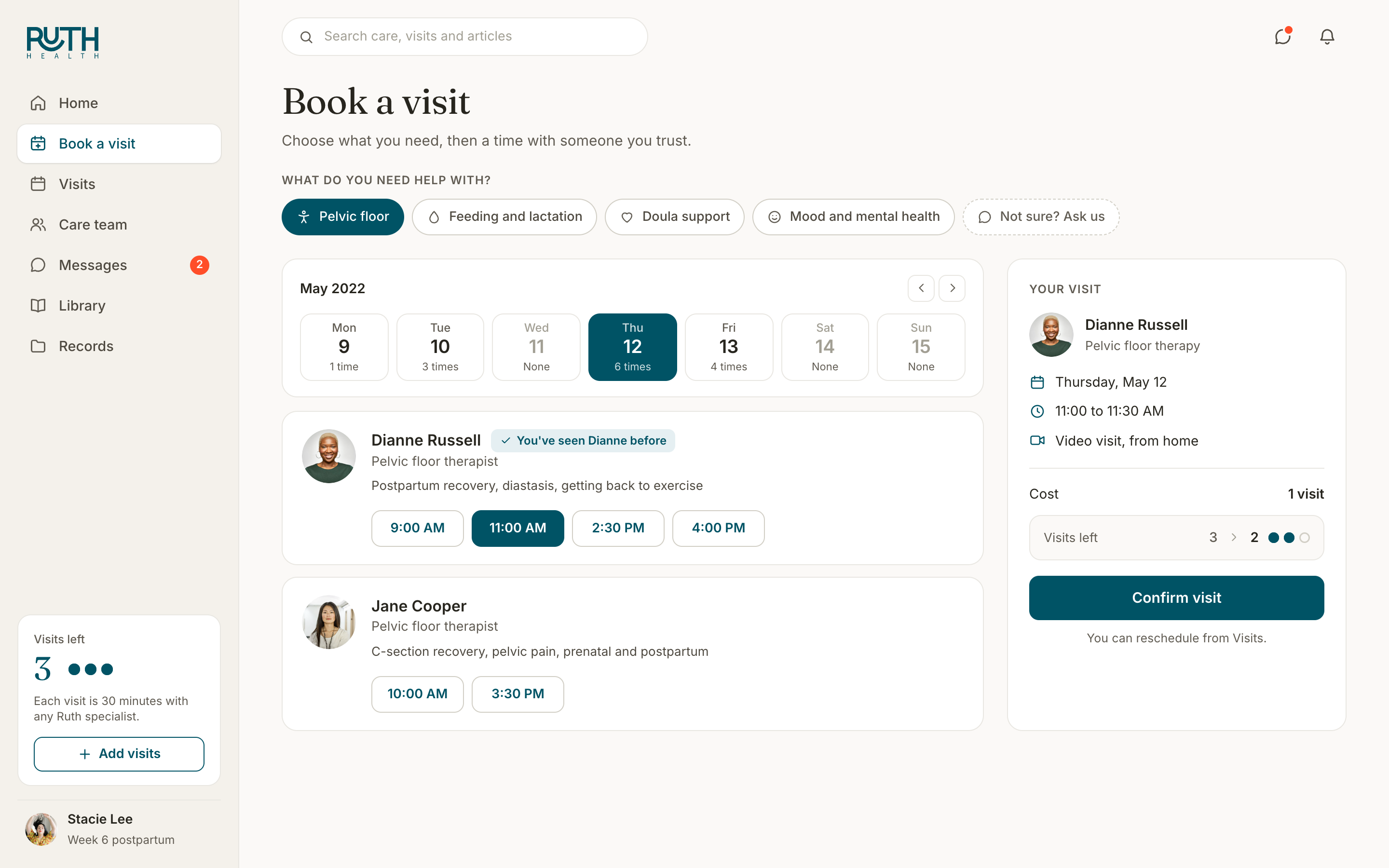
Show credits as visits. A credit only works if people know what it buys. So the balance is counted in visits and sits in the sidebar on every screen. Every booking shows what it costs and what will be left before you confirm. Every pack shows its price per visit, so the value of a bigger pack is plain: $99 a visit on its own, $83 in the twelve-pack. A short ledger shows where every visit went.
Humayun took our MVP functionality and updated brand guidelines to create a design system and product experience we could be proud of, while keeping the mothers we work with firmly in mind.
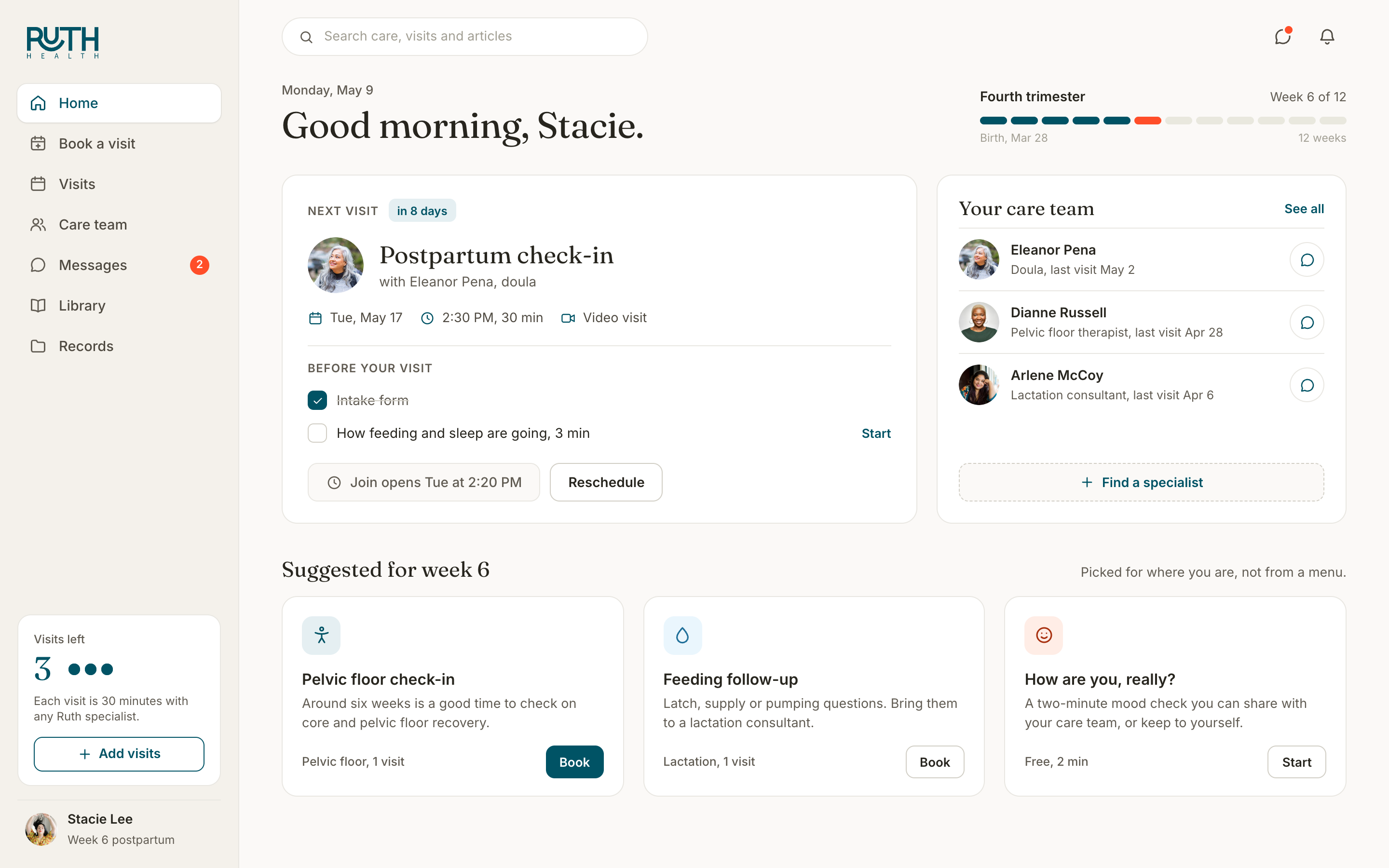
Start from where she is. Onboarding asks where she is in pregnancy or postpartum, and home uses it. It opens on her week of the fourth trimester, the next visit with its prep checklist inline, her care team, and suggestions that make sense for that week, instead of a directory of everything Ruth offers.

Book a person, not a service. In postpartum care, continuity matters. Someone who has already walked one therapist through her birth shouldn't have to start again with a stranger. Most booking flows ask for a service, then a time, and only show who you'll see at the end. Here it's one screen: pick what you need and a day, and every specialist shows their open times on their own card, with the one she has seen before marked. Then a single confirmation.

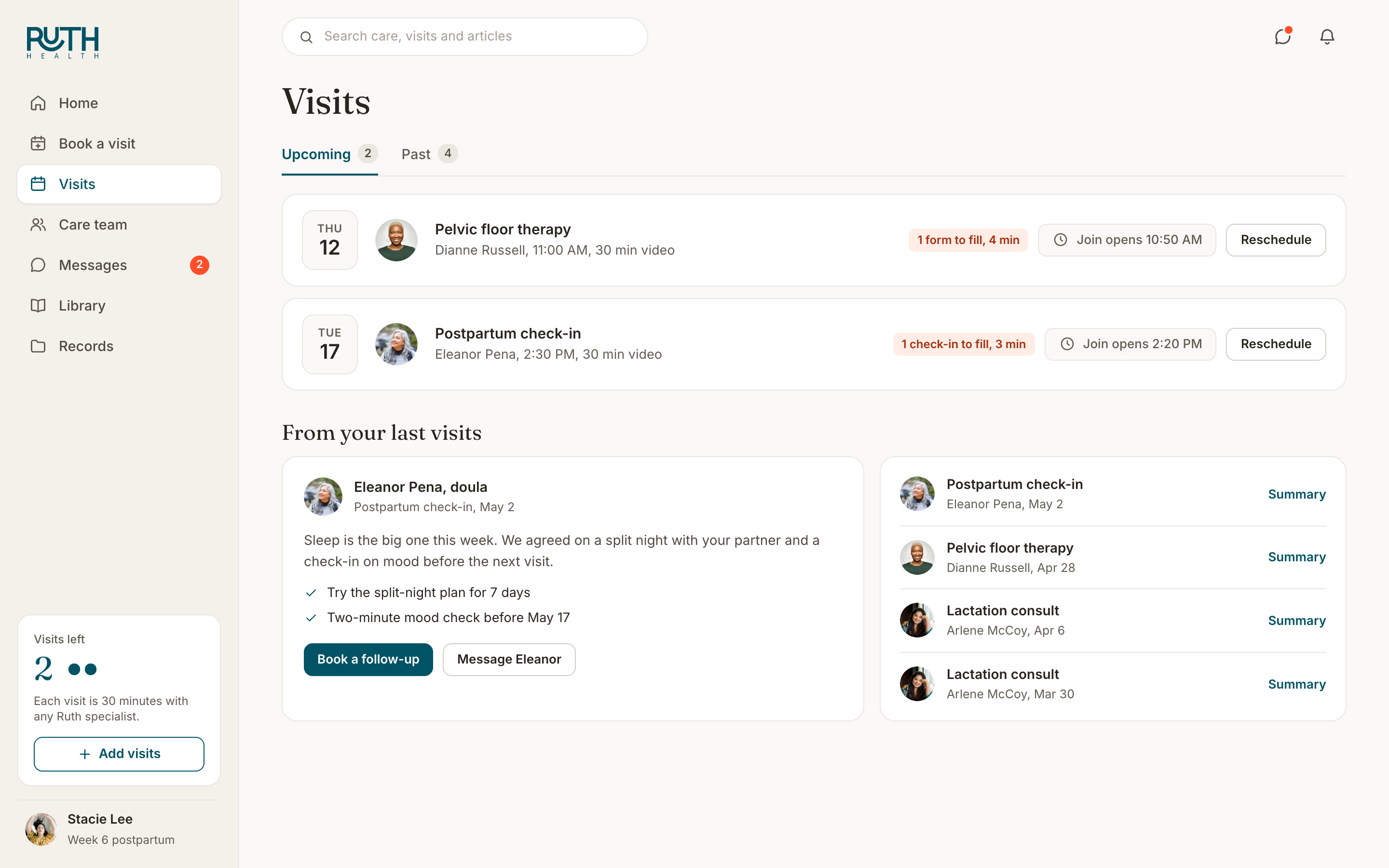
Every visit leads to the next. Visits shows what's coming up and what's left to prepare for each one. Past visits come back as a short summary from the specialist, with the plan they agreed on and a follow-up one tap away, so the care team's advice doesn't end when the call does.

Ruth got a complete design for the patient web app and a design system built from their updated brand, with the credit model at its center: four kinds of specialist, one balance, and booking that starts with who you'll see.
It's the kind of problem I like most, where the business model and the interface have to agree with each other. Credits only work if people can see what they're spending.